|
|
UNIT 4
Creating Links
|
|
See our entire collection of online tutorials |
Hyperlinks are a magic way you can jump from one web page to another. It's how you "surf the web". If you don't have any hyperlinks to your web page, you're not going to get many viewers. |
Yeah. Without links, we would get fewer hits than the "Navel Lint" web site. |
Your personal web site already has some hyperlinks in it. To see how they work:
2. Click on one of the links to another page. Then when you get to a new page, click on another link just to see how your pages are connected to one another.
|
Okay, we have a web page on homework in the 90's. I want to link that to a web page about how today's generation of kids are the first real computer generation. How do I tell the link to go there? |
By targeting the link. |
|
Okay, I've got the URL of a cool education web site from the '90s. What's next? |
2. Type in the URL. For example: www.actden.com 3. Press the Enter key. You will notice FrontPage has automatically converted the text into a hyperlink.
4. Check your new hyperlink by clicking the Preview tab and then clicking on the new hyperlink. |
That was a snap! What about text, Blip? Can we turn words like phat, chill, and dude, into hyperlinks, too? |
Sure we can. What are you planning to link to those words? |
Our "Slang from the '90's" page. |
Here's how to turn a word into a hypertext link that leads your visitors to a page within your web site:
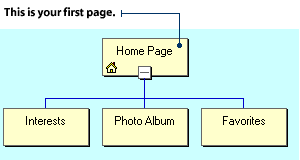
2. Go to the first page of your web site. (You'll see the title of this first page at the top of the flow chart in FrontPage Explorer's Navigation view.)
3. Type: "I have many interests and hobbies." 4. Select the word "interests" with your mouse and click on the Create or Edit Hyperlink button. This will open the Create Hyperlink dialog box.
5. Click the page or file name that you want to link to. For example: interest.htm The file name will appear in the URL box.
7. Click the Preview tab, then click on the hypertext link "interests" to check your new hyperlink. |
Blip, we forgot to include a page about the music that kids liked. I hope it's not too late to make the page and link to it. |
Mars! I can't believe we forgot to include The Backstreet Boys and Jewel in our site. We'd better get on it... |
To link to a new page:
2. Insert the cursor into the text area in FrontPage Editor's Normal view and type: "This is my latest web page." 3. Select the word "latest" using the mouse and click on the Create or Edit Hyperlink button. This will open the Create Hyperlink dialog box.
4. Click the New Page button. The New dialog box will appear.
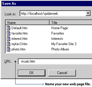
6. Be sure to save your new page. Type a short, descriptive file name into the URL box and click OK in the Save As dialog box.
|
I just know that our web site will be a hit. Do you think we'll get e-mail from some of our visitors? |
I sure hope so. We can make it easier for them to contact us by making an e-mail hyperlink. That way they can click on a link and e-mail us right away. |
Funk-o-matic! Our visitors won't have to type our e-mail address, so they'll have lots of energy to rave about our site. |
To create a hyperlink to your own e-mail address:
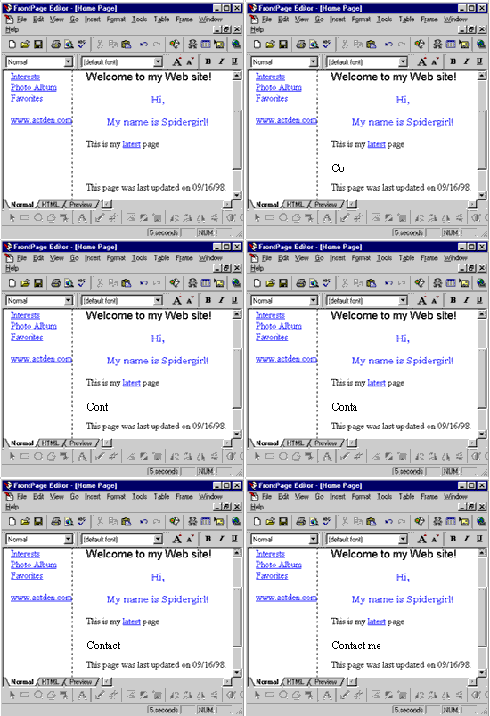
2. Insert the cursor into the text area in FrontPage Editor's Normal view and type: "Contact me."
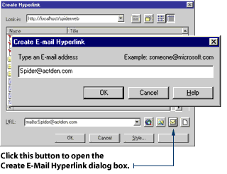
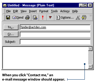
3. Select the words "Contact me" using the mouse and click on the Create or Edit Hyperlink button. This will open the Create Hyperlink dialog box. 4. Click the Make a Hyperlink that Sends E-mail button. The Create E-mail Hyperlink dialog box will appear. Type in your e-mail address and click OK.
5. Click OK in the Create Hyperlink dialog box. 6. Click the Preview tab, then click on the "Contact me" text to check your new hyperlink.
|
This web page of popular music is getting really long. We had better do something about it... |
Maybe we can use a smaller font? Or break up the list and put it on several pages? |
Oh, I have a better idea. We'll add bookmarks to our list. Those are links that you can use to jump to a new place on the same web page. |
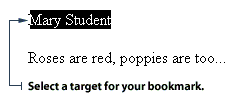
Picture yourself as the guide for a lot of guests trying to find their way around. Use bookmarks to guide your visitors through your web site smoothly - making them as comfortable as possible, like a considerate host. You can bookmark the top of the page, so it's easy for your visitors to get back to where they started. You can also bookmark an index, a table of contents, a subheading and anything else that helps to organize your web site content. The first step in making a bookmark is to select a target for the bookmark. The target is the spot you want your bookmark to jump to - like a heading or subheading.
2. Use your mouse to select the heading or subheading you have chosen as your target.
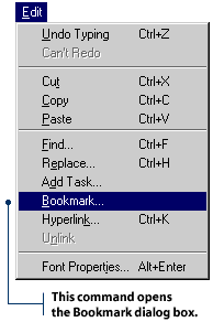
3. Click Edit on the Menu bar and select Bookmark. You will then see the Bookmark dialog box.
4. Type the name of your bookmark in the Bookmark Name box, then click OK.
|
Okay, we've got the bookmark set up, now we need to link to it. |
Wow! I bet the folks reading this web page are realizing that FrontPage is easier than mandelbroting a cyberfractometer. |
I kind of doubt that, since a cyberfractometer won't be invented for another 30 years. |
Oops. |
2. Use your mouse to select the text you just typed, then click on the Create or Edit Hyperlink button. This will open the Create Hyperlink dialog box. 3. In the Create Hyperlink dialog box, find the file that contains your bookmark. Click the file name and it will appear in the URL box.
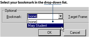
4. Click on the Bookmark drop-down list and select the name of your bookmark. Then click OK.
5. Test your new bookmark in Normal view by holding down the CTRL key while clicking the new hyperlink.
|
Hey, Blip, wouldn't it be neat if we could link pictures? Then we could put images of ourselves on the site and link them to our bios. |
I love it when you get your neurons firing! Let's go find out how to make pictures into hyperlinks. |
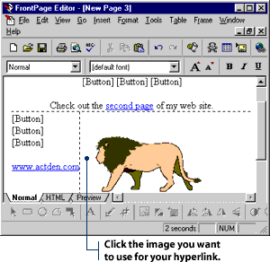
To turn a graphic into a hyperlink:
2. Select the image by clicking on it.
3. Click the Create or Edit Hyperlink button. This will open the Create Hyperlink dialog box. 4. Select the web page you want to link to, then click OK. |
Suppose I have a big picture and want different parts of the picture to link to different web pages. Do you think we can do something like that, Blip? |
You know... I think we can. I read something about creating image maps with FrontPage. |
Well, let's give it a try. I've got a class photo of the 6th Graders from Jefferson Elementary. Why don't we link each of the students in the photo to a description of their favorite activities. |
Brilliant! This effect is going to land us top marks for our project. |
An image map is useful when you have many related categories in your web site. For example, imagine you are making a web site for your school and you want to devote one page to each grade. You could use a drawing that shows a cross-sectional view of a school with many rooms. Each room could be used as a hotspot that acts as a hyperlink to the page for each grade. Any image can be made into an image map as long as it is large enough to assign more than one hotspot. To add a hotspot to a graphic:
2. Click the Polygon button on the Image Toolbar. 3. Place the cursor over the graphic. It will turn into a small cutting tool. 4. Draw a shape around a section of the graphic by dragging and clicking your mouse over the graphic.
5. Press the Enter key when you have drawn your hotspot shape. The Create Hyperlink dialog box will appear. 6. Select the name of the web page you want to link to, then click OK. 7. Click the Preview tab, then click on your new image map to check your linked hotspot.
|
Blue text and blue hypertext links. Hmm... we'd better do something about the color of our text links - otherwise people won't know where to click. |
Right. We wouldn't want our visitors clicking all over the page looking for links. I can't imagine anything more frustrating. Hey, why don't we hit another kind of "hotspot" later? You know, the type with lots of dancing and rave music. |
Concentrate, Pixel. We've got to finish this project first. |
Phooey! All work and no play makes Pixel a dull spacekid. |
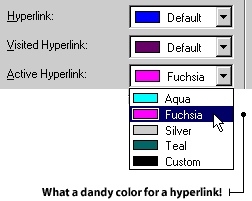
Blue hypertext tells your visitor: "Here is a link you have not yet followed." Purple text usually indicates a visited link. It tells your visitor: "Here is a link you have already followed." Red text is usually used for an active link. This color tells your visitor: "Here is a link that you are following right now." You can change these standard colors to contrast or blend in with the other colors in your web site. To change hyperlink colors:
2. Click the File menu and select Page Properties. 3. Click the Background tab on the Page Properties dialog box.
4. Select the three different hypertext colors from the drop-down boxes and click OK in the Page Properties dialog box
|
Yikes! Jefferson Elementary and Jackson High have changed their school URLs. We'll have to edit our links to their student pages. |
To change or delete the URL of a text hyperlink:
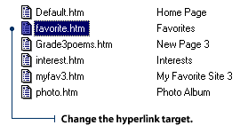
2. Click the hyperlink you want to change, then click the Create or Edit Hyperlink button.
3. To change the hyperlink target, click on a different file name. If you want to change the e-mail target or create a new page, click on the appropriate button.
4. To delete the hyperlink target, delete the URL in the Edit Hyperlink dialog box by pressing the Delete key, then click OK.
To change or delete the URL of a graphic hyperlink:
2. Select the graphic by clicking on it, then click the Create or Edit Hyperlink button. 3. To change the hyperlink target, click on a different file name. If you want to create a new page or change the e-mail target, click on the appropriate button.
4. To delete the hyperlink target, delete the URL in the Edit Hyperlink dialog box by pressing the Delete key, then click OK.
|
|
Good hyperlinks make visitors happy Dear Blabby, I'm expecting lots of guests at my first web site, and I want to make sure they all have a good time. I have quite a few pages in my site. Naturally, I want to be sure everyone can find his or her way around. I know if they get lost, they'll just head for the exit - you know how demanding guests can be nowadays! Do you have any suggestions for me? Harried Host in New Hampshire
Congratulations on finishing your first site. In time, you will learn more and more
about how to be a good host. It's just one of those things that comes with experience.
For now, I can give you a sure-fire method that will keep your guests happily
occupied during a lengthy visit to your site.
At the top of each web page in your site, include a hyperlink to every other page.
This will allow your visitor to jump quickly to anywhere in the site they might like
to go. At the bottom of every page, include a bookmark link to the top of the page.
This way, your visitors will be able to get wherever they want to go with only two
clicks of the mouse. Using descriptive hyperlink names will also be a big help.
Let's use an example. Imagine you're a teacher in a school and you're making a web
site that features activities of all the different sports teams. You have floor
hockey, track and field, swimming, soccer, and the playground hopscotch championships.
You call the opening page file "sports." The top page has five links - one to each sport.
Now, let's say your visitor wants to go to the floor hockey page. At the top, they see
five links - one to each of the four other sports, and one back to the opening page.
They scroll down the page, reading all about the amazing wins and losses of your
school's teams. Then, when they reach the bottom, they find a link to the top of the
page. They click the link, move back to the top, and choose another page to visit.
Their visit is clearly laid out, and they can find their way with no problem at all.
Happy Web-weaving!
Perhaps you can settle a disagreement that I am having with my project partner, Sheila. We are creating a web site to promote an upcoming teachers' conference. We have a wonderful relationship and have agreed on every aspect of the site - that is until Sheila decided to go color happy with the hyperlinks. On certain pages, our hyperlinks are blue. On other pages, they are green. Sometimes they are pink, or yellow, or even mauve! Sheila says it adds interest. Personally, I think color-switching makes our web site look unprofessional and inconsistent. Sheila reads your column, Blabby. I know if she sees what you have to say about coloring hyperlinks, she'll come to her senses. Blue in St. Louis
You will have to sit Sheila down and explain to her the importance of keeping things consistent in a web site. Consistency, of course, applies to the color of hyperlinks through your entire web site.
Web visitors often use hyperlink colors to remember which pages they have visited in your web site. For instance, "Green means I haven't been there. Blue means I have." If you keep switching colors on them, you will confuse them, cause all sorts of angst, and generally upset them.
Be firm with Sheila. The two of you should decide on one color for your "unvisited" hyperlinks and one color for your "visited" hyperlinks, then stick to the color scheme.
|